
Jennifer Ott
Yellow and orange are, hands down, the happiest hues of all. They remind us of glowing sunshine, pretty spring flowers and refreshing citrus fruits. They’re attention-grabbing hues best reserved for elements in a room that you want to stand out.If you lack ample lighting, I’d suggest using the bolder shades sparingly, as they can easily overwhelm a space, especially a small one. I’ve gathered seven examples of how to decorate with orange and yellow, and created paint color palettes inspired by each room so you can add some bold, warm color to your own home.

Gary McBournie Inc.
My favorite colors for ceilings are blue or yellow. Blue mimics the sky and gives a room a calm, expansive feeling. Yellow creates a sunny glow that warms up the entire room, as shown here. If you live in a hot and sunny climate, you probably want to stick to cooler colors, such as blue. But those of you in a cold or overcast climate can bring warmth and brightness into your home with hot yellow and orange hues. The orange used here is quite vibrant and works best as a small accent color — on the headboard and in the bedding.
Jennifer Ott Interior Design
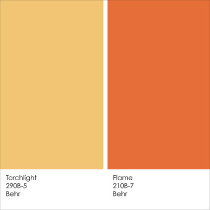
Example palette: Torchlightand Flame, from BehrNote: Due to differences in how interiors are lit and photographed, as well as how computer monitors are calibrated, the colors you see in these swatches and photographs may differ slightly from the actual colors. It’s always a good idea to view actual paint swatches from the manufacturer, or better yet, evaluate a large paint sample of the color you are considering, before finalizing your selection.
Linda Jaquez Architectural Photography
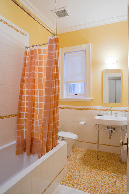
I love this happy-hued bathroom. How could you not start your day on the right foot stepping into this space first thing in the morning? The walls are the perfect shade of yellow — neither too soft nor too bright. A nice punchy orange is brought in through the tile and the shower curtain. If you want a low-commitment option using this palette, just stick to paint and accessories in the featured hues — they are relatively easy and affordable to change down the road.
Jennifer Ott Interior Design
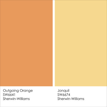
Example palette: Outgoing Orange and Jonquil, from Sherwin-Williams
Maria Killam
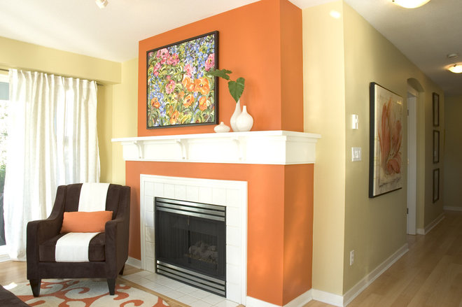
This is a lot of bold color, but it works here because there is nothing else competing with the hues. Bright colors are best paired with toned-down and neutral furniture, textiles and accessories. This is also a great example of using assertive color to call attention to desirable architectural elements, such as a fireplace.
Jennifer Ott Interior Design
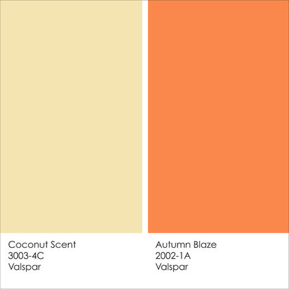
Example palette: Coconut Scent and Autumn Blaze, from Valspar
California Closets
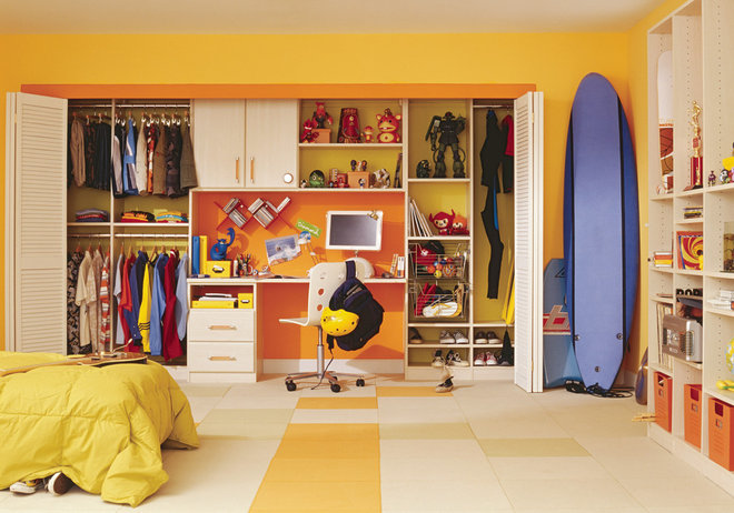
These fun colors work well in a kid’s or teen’s room. I like how the juicy orange color was used to set off the desk niche.
Jennifer Ott Interior Design
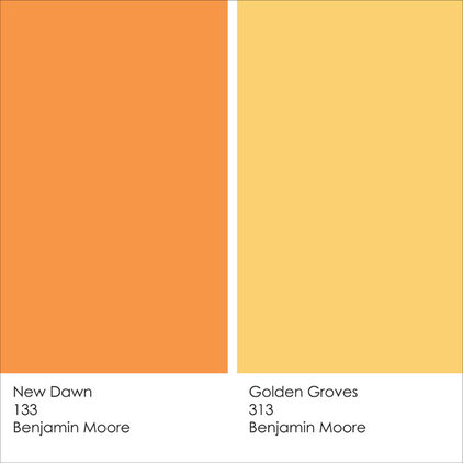
Example palette: New Dawnand Golden Groves, from Benjamin Moore
Matt Varnado – Varnado Photography
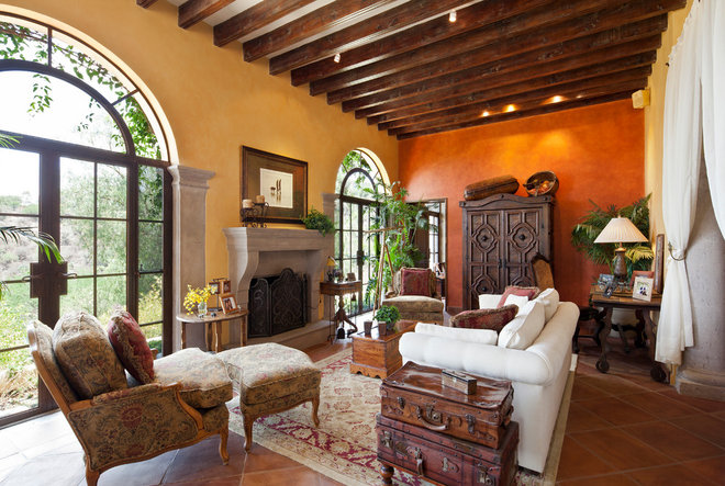
We tend to associate bold color with modern and contemporary spaces, but you can also inject big color into more traditional rooms. The rich reddish-orange wall color here pairs well with the lighter yellow-orange hue as well as the deep wood tones used throughout the room. What a gorgeous space — perfect for curling up in front of the fire on a cold evening.
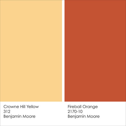
Jennifer Ott Interior Design
Example palette: Crowne Hill Yellow and Fireball Orange, from Benjamin Moore
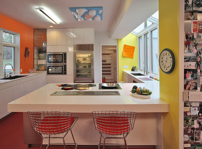
Kenneth M Wyner Photography Inc
Neon yellow and orange hues are best used sparingly, and adjacent to windows where plenty of natural light can help ease the intensity. I like the small swaths of color here that punch up the otherwise white kitchen.
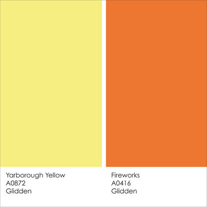
Jennifer Ott Interior Design
Example palette: Yarborough Yellow and Fireworks, fromGlidden
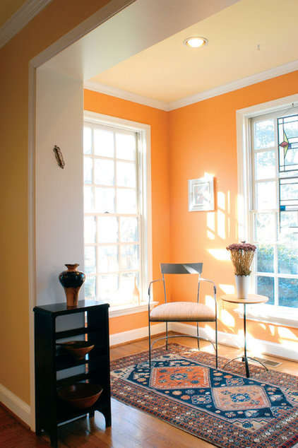
Here’s another colorful sun-filled space with a bold orange on the wall. This is a rather saturated orange, but the beautiful oversize windows cut into the painted area, so it doesn’t feel overwhelming. The muted orange-yellow on the ceiling offers a soft contrast to the wall color. A white ceiling here could have looked too cold and jarring against the orange.
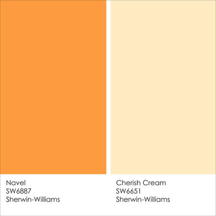
Jennifer Ott Interior Design
Example palette: Navel andCherish Cream, from Sherwin-WilliamsTell us: Are you a fan of these hot orange and yellow color combos, or do they leave you cold?
Courtesy of your Arcadia Real Estate Agent


Speak Your Mind